Zaffran

Viman Nagar, Pune
3000 sq.ft.
Completed
February 2016

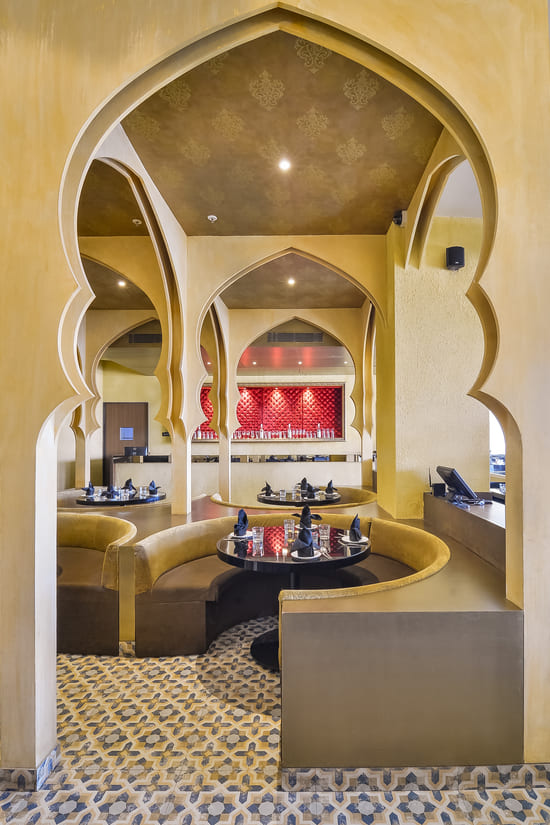
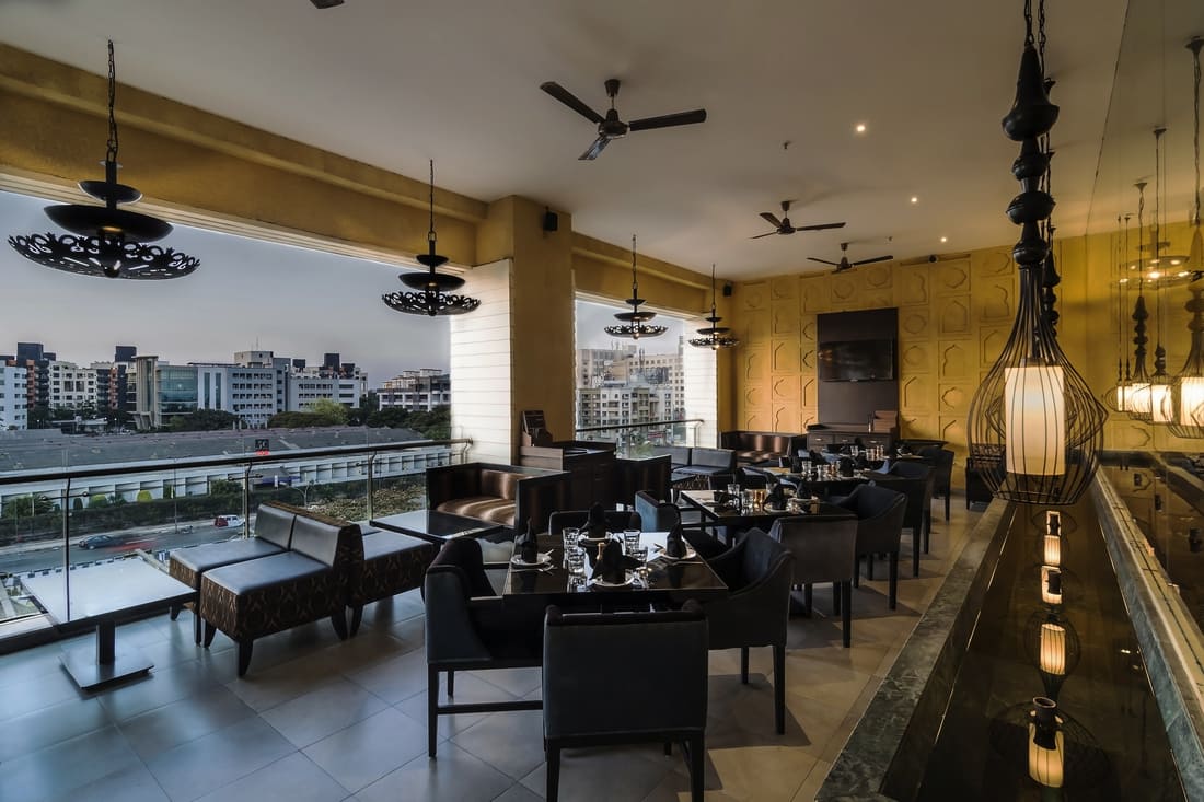
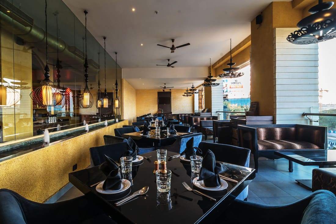
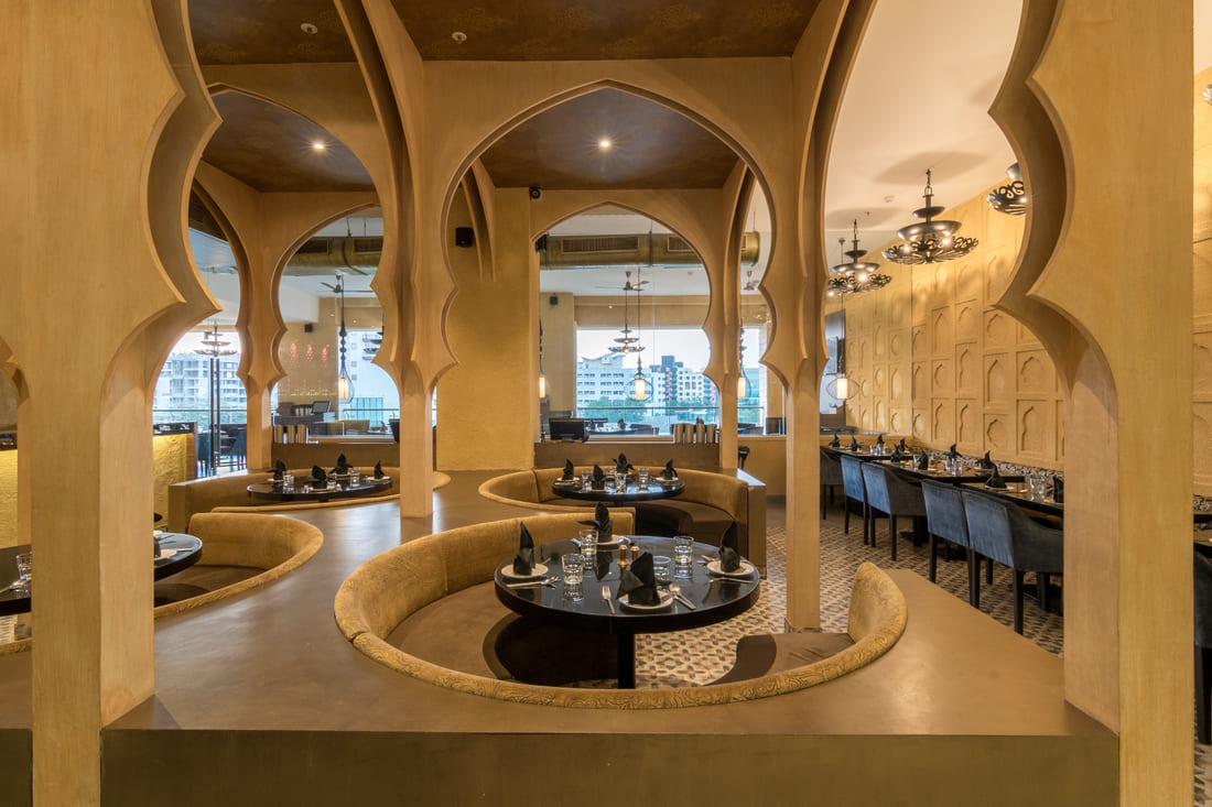
The concept of the interiors was narrowed down to and defined as ‘a contemporary take on Mughal art and architecture’, since Zaffran’s main cuisine was North Indian Mughlai.
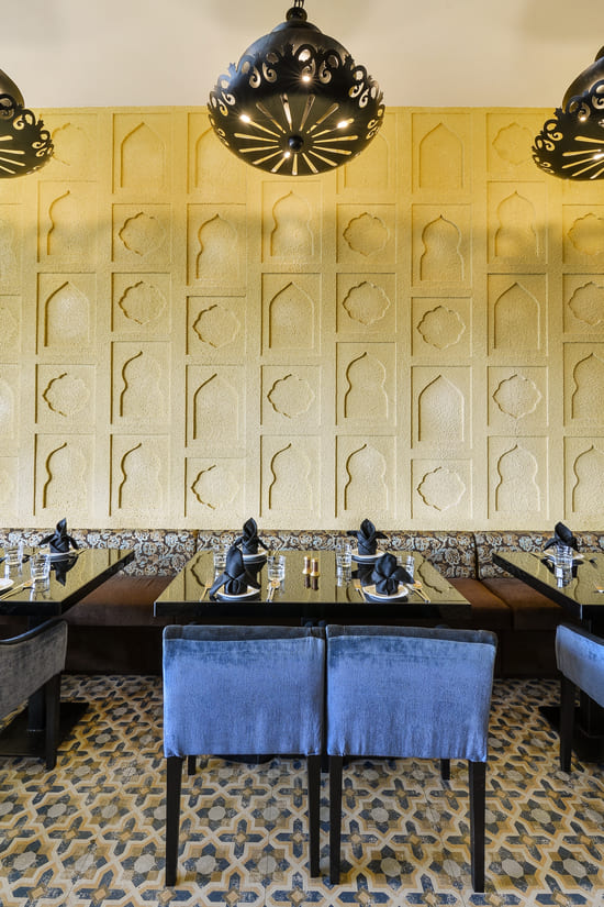
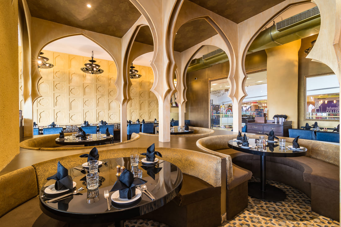
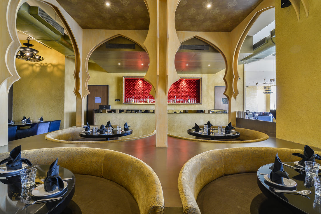
Thus, elements such as arches, domes, water features, intricate flooring patterns, rich motifs in upholstery, jaali’s etc. were extrapolated, stripped down and reassembled to revive the sublimity of timeless entities of the past. Attention to detail was given via customizing wrought-iron filigree type lamps, table inlay motifs and relief panels on walls by using specially treated stucco textures. By designing a series of custom made high arches in wood, dusted with dull gold, we introduced symmetry, scale and a sense of grandeur in each restaurant while at the same time maintaining a contemporary aesthetic that was not too elaborate.
The Zaffran Pune branch makes its own unique appeal with the textured wall relief which brings its own inflection of aesthetic to the interiors, on top of the ones defined above which bring in the same vibrancy, elegance and panache to the final outcome. From floor, to the ceilings, to the furniture, the restaurants gleam with a contemporary-royal aesthetic.

Flexibility, fluidity and future ready best describes this three and a half thousand square foot office in the heart of Mumbai. Characterized by a limited colour and material palette, it finds luxury in simplicity rather than pretentious adornment. 

This ideology led us to an open plan design where the central work space is completely transparent from outside in. Multiple types of seating’s were introduced in this area to allow for free and open discussions and group meetings. This space flowed into a chic café which was an informal work space as well as a break out space for the people. 

Great attention was given to geometry as it translated into every material that was used, from the wood, veneers, metal partitions, fluted glass and metallic tiles. The functionality and the visual quality of the space are intertwined to provide a complete modern work space environment.

Tags
,
d
Sed ut perspiclatis unde olnis iste errorbe ccusantium lorem ipsum dolor